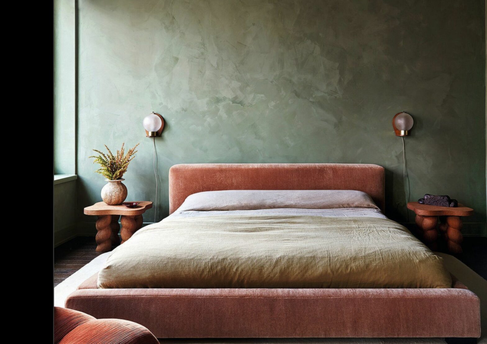
COLOUR DRENCHING. AKA MONOCHROME COLOUR SCHEME. WHAT IS IT AND WHY IT WORKS
Everyone is loving colour drenching. Living rooms, kitchens and bedrooms are receiving a total colour-match makeover that is sweeping across the decorating world. So, what exactly is colour drenching and why it’s worth considering it?
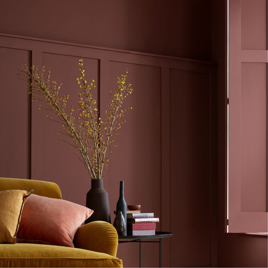
Room decorating and painting trends have evolved over the years, reflecting changing styles, cultural influences, and personal preferences. From bright and bold colours in the 1950s and 60s to neutral and subdued colour schemes in the 1990s to the earthy tones of terracotta and warm browns for an inviting, cosy spaces, each era has brought its own unique trends and styles.
During the many waves of changing colour schemes and materials, there was one rule that rarely failed: ceilings, coving, and skirting boards were left white, almost as if they were not part of the overall decorating scheme.
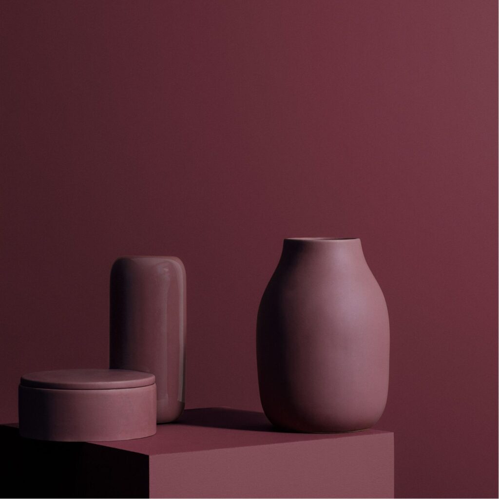
Imagine placing a vase upside down and pouring a whole pot of colour on it. And now, imagine if you did this across the entire room.
Ceiling, coving, walls, skirting, but also doors, radiators, wardrobe window sills, shelves and even furniture and accessories. One colour embracing every single element.
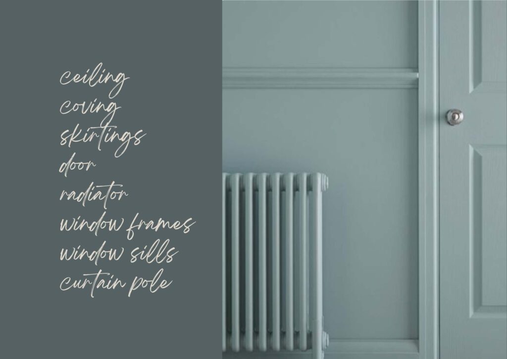
Rather than incorporating multiple colours or patterns, colour drenching – or monochrome – relies on the impact of a single colour to establish the tone of the room.
There are many reasons why I believe it’s effective and worth considering when rethinking the look of your rooms. I love it because:
It creates a beautiful canva, drawing the attention to more relevant objects – an artwork, a sculptural vase, a flower arrangement.
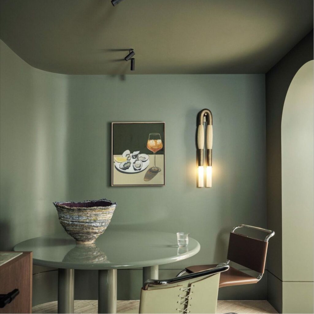
It makes the room look more spacious, blurring boundaries between objects. This is due to the seamless effect, with no interrupted lines.
It helps conceal elements that are often unattractive, such as radiators, window sills and frames.
It has a profound impact on the room’s aesthetic, adding depth and dimension. As many colour changes do, just more powerful.
It’s soothing, enveloping, and calming. The ultimate cocooning space for your moments and memories.
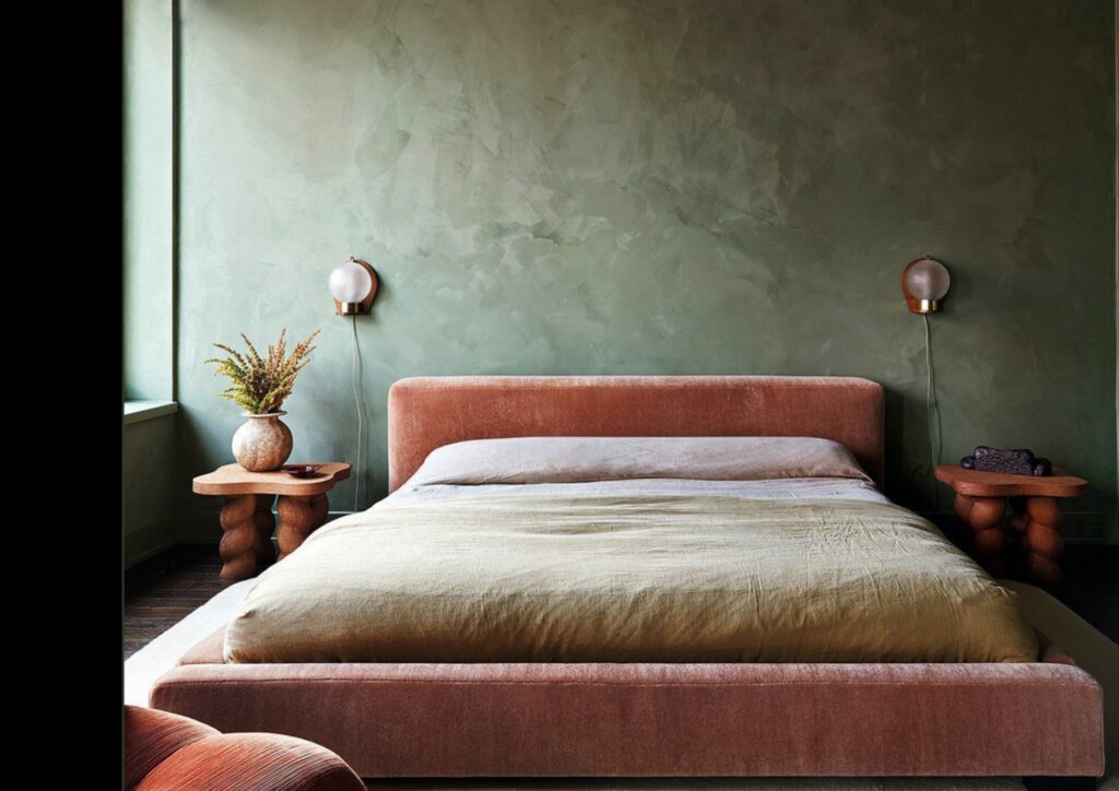
It is definitely contemporary. It helps to achieve edge and balance in more classical schemes without necessarily being bold nor ostentatious. It might feel bold if you step out of your comfort zone, but, generally, the resulting effect is beautifully soothing and relaxing.
Creating this serene atmosphere where everyday life happens, has always been central in my design vision.
I am drawn towards Wabi-Sabi, a Japanese way of life and aesthetic ideal that celebrates the beauty of imperfection as well as the poetry of the inconspicuous details of everyday life.
I love to bring this to life, achieving simplicity without inviting boredom or crossing over into ostentatious austerity. Fashioned out of natural elements and materials, layered with unrefined textures and soft edges, inhabited by pre – loved and repurposed items, my spaces are modern and enveloping, elegant and relaxed, unconventional and lived-in. To bring them to life, I work with clients and artisans to create one-of-a-kind solutions that leave room for the unexpected, for life to happen.
This design trend has become so popular that even brands with a more classical style are fully embracing it. Those who know me are aware that I don’t usually follow trends, and I wouldn’t recommend my clients to do so either. My advice is always go for something that speaks to you. It’s your story you want to tell.
However, there are times when a trend can spark a new perspective and inspire us to explore beyond our usual boundaries. And this is definitely the case.
I will soon share my ways to embrace colour drench with a personal touch. Stay tuned.

